http://www.solutionsellingblog.com/home/tag/solution-mapping
Problem solutions maps are used to help solve an issue and can be used by anyone. Above is a map which shows the steps for product managers or marketers to take to find a solution to a problem.
Tuesday, July 24, 2012
Political maps
http://www.worldatlas.com/aatlas/infopage/political.htm
Political maps show the governmental boundaries between countries, cities, states etc. As shown in this map different colors are used to separate the political boundaries.
Political maps show the governmental boundaries between countries, cities, states etc. As shown in this map different colors are used to separate the political boundaries.
Road map
Road maps show major highways, roads, and cities. When planning a trip a road map is helpful for planning driving directions. Above is a detailed road map of London.
Physical maps
http://www.mapsofworld.com/physical-map/south-america.htm
Physical maps show the physical features of an area such as mountains, rivers, lakes. In this physical map of South American mountain ranges, rivers, plains are displayed.
Physical maps show the physical features of an area such as mountains, rivers, lakes. In this physical map of South American mountain ranges, rivers, plains are displayed.
Resource maps
Parallel coordinate graph
http://andrewgelman.com/movabletype/mlm/mdg1.png
A parallel coordinate graph is a graph of multivariate data using parallel lines to indicate a variable with lines
branching between them to indicate the data of that variable. This graph shows 10 variable being X1-X10 and the interplay
between them represented by the multitude of lines.
Triangular plot
http://www.lithoprobe.ca/Images/slidesets/tools/lp76m.jpg
Triangular plot is a graph of 3 variables with varying amounts of independence,
only 2 variables must be known to find its graphic location. This triangular plot show the relationship between three
chemicals.
Windrose
http://www.vistadatavision.com/uploads/images/Gallery/Wind_Rose_Distrubution/wind_rose_vector_1.png
Windrose is a diagram to display wind speed and direction over a period
of time using a subdivided circle depicting the compass with varying length
bars indicating the direction and speed of wind. This Wind Rose graph shows the varying wind conditions in
both direction and speed.
Population profile
http://www.aaiusa.org/page/-/Images/Demographics/FL_PopulationGrowth.png
A population profile is graphic overview of certain key demographic statistics. This graph shows the growth of Arab Americans in the United
States.
Index value plot
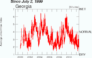
http://waterwatch.usgs.gov/regplots/real/real_ga_2.gif
The Index value plot displays a current statistic against the same historical
static to show discrepancies. Above is the water usage over a period of time is plotted to show
variance.
Nominal area choropleth map
http://my.ilstu.edu/~jrcarter/Geo204/Choro/Tom/hispanic_race_fl-H1_FINAL.gif
Choropleth map utilizing nominal data.
Unstandardized choropleth maps
http://pubs.usgs.gov/fs/2005/3051/images/2000choropleth.gif
Series of choropleth maps that utilizes raw numbers instead
of standardized data. This map show actual information, it has not been
standardized in any way.
Standardized choropleth maps
http://ars.sciencedirect.com/content/image/1-s2.0-S0167587712000396-gr3.jpg
Series of choropleth maps with standardized data to allow
comparison. This choropleth map
utilized standard ratios to allow for easy comparison.
Univariate choropleth maps
http://www.cdc.gov/pcd/issues/2007/oct/images/07_0091_02.gif
A choropleth map that displays data from a single variable.
Bivariate choropleth maps
http://ars.els-cdn.com/content/image/1-s2.0-S0749379705003582-gr14.jpg
Choropleth map that displays two distinct variables on one
map by including different data sets of symbols and numbers.
Unclassed choropleth maps
http://www.esds.ac.uk/international/images/uchoropleth.gif
A choropleth map that shades directly proportional to the data values so classification is unnecessary
Classed choropleth maps
http://iopscience.iop.org/1748-9326/5/4/044008/fulltext/
A choropleth map that including a classed frequency legend
with a frequency histogram and shading. This choropleth map
shares a class frequency size between the 4 different choropleth maps
Range graded proportional circle map
http://www.neiu.edu/~nerobert/391/Proportional%20Circle.jpg
A proportional circle map that uses several distinct circle
sizes to depict a range of the specified data. In this map the population of German ancestry in parts Chicago, IL is represented by the size of the circle.
Lorenz curve
Box plot
A box plot is a depiction of a set of data measured on an interval scale
that shows distribution, mean, and standard deviation. This box plot shows the
energy efficiency of 4 different machines under different load settings.
Bilateral graph
http://www.dplot.com/examples/bar-chart-with-side-by-side-bars.gif
A bilateral graph displays two or more related data sets through one
of several means. This bar char is a type of bilateral graph showing the
relationship between live load and number of observations.
Similarity matrix
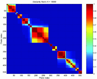
http://www.fxpal.com/systems/MediaAnalysis/sim10000.gif
A similarity matrix is the similarity between two data pints. For this similarity matrix there were a number of photos compared to find the similarities.
A similarity matrix is the similarity between two data pints. For this similarity matrix there were a number of photos compared to find the similarities.
Stem-and-leaf plot
A depiction of quantitative data by having two columns, one
with the shared component and the other with the individual component. This graph shows the similarities in infant mortality rates
in different countries located in Western Africa.
Correlation Matrix
http://www.sciencedirect.com/science/article/pii/S0360301611032871
A correlation matrix displays large numbers of correlated coefficients in a
tabular format. In this correlation matrix the variables are represented through the different colors starting with green representing low correlation between the two variables and ending with red representing high correlation.
Histogram
http://www.ultimate-photo-tips.com/what-is-a-histogram.html
A histogram is a graph that represents the distribution of large
sets of data. This graph is a population histogram of NY county. Each bar provides the number of people in each age group living in this county.
Climograph
http://www.colorado.edu/geography/extra/geogweb/manitousprings/intro/page2.html
A climograph is used to show the temperature and
precipitation of a specific area usually over a 12-month period. This
climograph shown depicts average conditions for Manitou Springs, Colorado.
Star plot
A star plot is a map is a graphical data analysis method to determine the behavior
between variables in a multivariate data set.
Continuously variable proportional circle map
http://www.lib.utexas.edu/maps/europe/west_germany_ind_1972.jpg
A continuously variable proportional circle map is a map that relates circle scale to a specific data set. This scale shows the size of industry in Western Germany through circle size while showing percentage of each industry through the percentage of the circle.
A continuously variable proportional circle map is a map that relates circle scale to a specific data set. This scale shows the size of industry in Western Germany through circle size while showing percentage of each industry through the percentage of the circle.
DOQQ
https://www.e-education.psu.edu/natureofgeoinfo/c6_p17.html
The Digital Ortho Quarter Quads are digital aerial images produced by the USGS. The image above is an accurate image from the features of Bushkill, PA in true geographic position.
The Digital Ortho Quarter Quads are digital aerial images produced by the USGS. The image above is an accurate image from the features of Bushkill, PA in true geographic position.
DEM
http://tahoe.usgs.gov/DEM.html
A digital elevation model is a digital model of a terrain's surface. In the image above is a 3D view of elevation for the Lake Tahoe Basin.
A digital elevation model is a digital model of a terrain's surface. In the image above is a 3D view of elevation for the Lake Tahoe Basin.
DLG
http://tahoe.usgs.gov/DLG.html
Digital line graph is data files containing vector representations of cartographic information derived from USGS maps. Above is a DLG of the Lake Tahoe Basin rivers, lakes, vegetation, and roads in red.
Digital line graph is data files containing vector representations of cartographic information derived from USGS maps. Above is a DLG of the Lake Tahoe Basin rivers, lakes, vegetation, and roads in red.
DRG
http://egsc.usgs.gov/isb/pubs/factsheets/fs10602.html
Digital raster graphic is a digital image saves to a computer by scanning a topographic map. This map shows Juneau, Alaska in DRG format.
Digital raster graphic is a digital image saves to a computer by scanning a topographic map. This map shows Juneau, Alaska in DRG format.
Isopleths
http://www.ksn.com/content/weather/images/national_temp_isopleths.aspx
Isopleths simplify data over a continuous distribution and uses this data as a third demension on a standard geographical map. In the above map national temperatures are shown with isopleths.
Isopleths simplify data over a continuous distribution and uses this data as a third demension on a standard geographical map. In the above map national temperatures are shown with isopleths.
Isopach
http://www.glossary.oilfield.slb.com/DisplayImage.cfm?ID=114
Isopachs, or contours, connects points of equal thickness. This map includes an isopach of an aquifer with contours shown in red dashes.
Isopachs, or contours, connects points of equal thickness. This map includes an isopach of an aquifer with contours shown in red dashes.
Scatterplot
http://tellier.edublogs.org/2011/02/10/scatter-plot-examples/
Scatterplots use horizontal and vertical axes to plot data points. A good visual picture of the relationship between two variables is shown. The scatterplot above shows the hours of study and the test scores of students.
Scatterplots use horizontal and vertical axes to plot data points. A good visual picture of the relationship between two variables is shown. The scatterplot above shows the hours of study and the test scores of students.
Isohyets
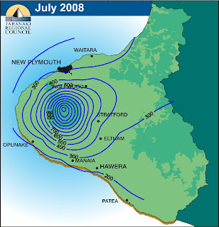
http://img.scoop.co.nz/stories/images/0808/3d0ea09ab5cbfe1ff03f.jpeg
Isohyets connect points of equal precipitation.
Isohyets connect points of equal precipitation.
Isotachs
http://www.erh.noaa.gov/btv/events/28Oct2008/300mb_isotachs_28_18z.gif
Isotachs are used in weather maps, they connect points of equal wind speeds.
Isotachs are used in weather maps, they connect points of equal wind speeds.
Isobars
http://www.newmediastudio.org/DataDiscovery/Hurr_ED_Center/Hurr_Structure_Energetics/Closed_Isobars/Closed_Isobars_fig02.jpg
Isobars are generally used in weather maps, connecting points of equal barometric pressure.
Isobars are generally used in weather maps, connecting points of equal barometric pressure.
LIDAR
https://www.saic.com/geospatial/images/lidar1.jpg
Light Detecting and Rangin(LIDAR) uses short wavelengths to remotely sense different properties of dispersed light to acquire information. This is a LIDAR photo of a large metropolitan city.
Light Detecting and Rangin(LIDAR) uses short wavelengths to remotely sense different properties of dispersed light to acquire information. This is a LIDAR photo of a large metropolitan city.
Doppler radar
http://newspaper.li/static/b1ce43cc20614e2b3e23a598333e69ef.gif
A doopler radar is a specialized radar that uses the Doppler effect to deduce velocity data of distant objects. Above is a doppler radar photo to show the speed of a hurricane over central Florida.
A doopler radar is a specialized radar that uses the Doppler effect to deduce velocity data of distant objects. Above is a doppler radar photo to show the speed of a hurricane over central Florida.
Mental map
http://peterfox.com.au/mental_map.htm
A mental map is a map of an enviornment within the mind of an individual that reflects the knowledge and biases of that individual. They way they perceive this map is a result of the way that individual acquires and processes information. This picture is a deception of the way an individual views their surrounding area, not necessarily an accuarte deception of that area.
A mental map is a map of an enviornment within the mind of an individual that reflects the knowledge and biases of that individual. They way they perceive this map is a result of the way that individual acquires and processes information. This picture is a deception of the way an individual views their surrounding area, not necessarily an accuarte deception of that area.
Thematic Mpas
http://soils.usda.gov/use/thematic/temp_regimes.html
A thematic map is a map designed to associate a theme with a specific geographic area. This map shows the differing soil temperature regimes of different parts of the United States.
Planimetric map
http://www.ncdot.gov/doh/preconstruct/highway/photo/Products/Planimetric_maps_default.html
A planimetric map is a map indication only the horizontal positions of a feature without regards to elevation. This planimetric map depicts a neighborhood and the otherwise unseen underground storage tanks.
A planimetric map is a map indication only the horizontal positions of a feature without regards to elevation. This planimetric map depicts a neighborhood and the otherwise unseen underground storage tanks.
Subscribe to:
Comments (Atom)


